
Thrones, Bones and Cobblestones
What do you do when a saint looses his shrine? And what if he was not much of a saint anyway? That was the dilemma I faced when I entered a competition to design a new shrine for a medieval saint - and won! This mystery man rested for more than seven centuries in a marvelous shrine of gold, enamel and jewels. But curatorial issues won out over ancient pieties and the shrine was moved to a new museum.
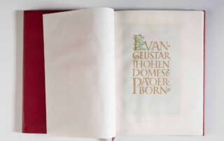
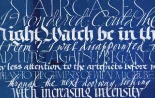
THE PADERBORN LECTIONARY
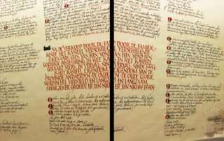
I have worked for the Archdiocese of Paderborn in Westphalia for many years, doing painted wall inscriptions for exhibitions, stained glass for the choir school, monuments for public spaces and even inscriptions for two immense bells for the cathedral carillon. Paderborn was an important residence of the Emperor Charlemagne; and so it seems fitting that the archdiocese, like the emperor, should keep calligraphers busy.
AND THE WORD WAS MADE STEEL
How many tributaries of the social media delta can one follow at a time? March 2017 saw me sinking into the quicksands of Instagram, meaning of course that my WordPress blog was ignored completely. Time for an update, though many of you have followed these projects on the tiny screen.
DREAM A LITTLE DREAM OF ME
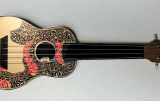
If I could only play the damned thing! But writing the words to this dreamy love song is second best and probably just as fun. The Concertgebouw in Bruges, in collaboration with BruggePlus, has asked a number of artists to draw and paint on ukeleles, which will be auctioned in support of the musical life of the city.
SUBLIME SIMPLICITY
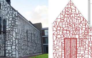
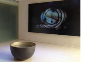
Igor De Baecke and I have just finished a most wonderful video installation for the youth church at Hardehausen in Germany. The project is part of a complete rebuilding of the 1960s horror by the great architect Johannes Schilling of Cologne. We were asked to create a video installation on the theme of baptism for the entrance to the church.
KYOTOSHOP
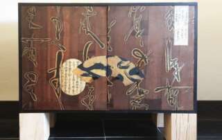
Necessity is indeed the mother of invention. What to do with the television in the living room, that was the pressing issue. We couldn’t find a single piece of furniture that fit the space, was in budget and appealed to our rather unusual tastes. So of course, I made one instead, drawing on my love of Orientalism, romantic fakes and pure calligraphic gestures. Several people thought we must have found the cabinet at the flea market in Kyoto.
WALL TO WALL
How would you like to collaborate with me on a new project? The castle of Hingene, near Antwerp in Belgium, is creating a time capsule in calligraphy. For a short time, all the wall hangings of the chateau will be taken down for restoration. The director of the castle, Koen De Vlieger, is taking this opportunity to ask the entire world (I’m not kidding) to send in messages that I will commit to eternity by writing them on the walls.
IMAGINING MATISSE
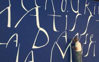
Large surface, large letters. This time in the Fondation Louis Vuitton in Paris for a magnificent exhibition of early 20th century paintings from the collection of Serguei Chtchoukine. One of the collector’s greatest paintings, La Danse by Matisse, was not allowed to travel from Moscow for the show.
LET THE SPARKS FLY
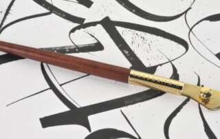
I would like to introduce you to the newest pen in my wonderful arsenal. I collaborated with Handwritmic (www.handwritmic.com) to develop this beautiful and extremely versatile ruling pen. The pens are hand crafted from the finest materials by craftsmen in the Biella region of Italy. The basic idea for this innovative new pen came from the German calligrapher Friedrich Poppl, but has been redesigned and vastly improved using the most advanced technology to create a tool with true Italian elegance and beauty.
FAT CATS TAKE ON LA SERENISSIMA
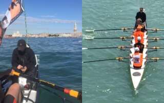
Is there a better combination? Old college friends, rowing and Venice. The old Princeton crew got together for this year’s Voga Longa, a 35km row around the Venetian lagoon with a final sprint up the Grand Canal. Some of us had not seen each other in decades.
RIJKSBOOK 3
I have never been much for flourishes, as they distract from the form of the letters and belong too solidly to the past. But in this project, flourishes serve as fanfares to some of the greatest paintings in the world. Here I developed a rather unconventional style of flourish related to the strapwork decorations of 17th century architecture.
RIJKSBOOK 2
The Rijksbook took me back to my calligraphic roots, requiring me to do formal lettering in styles I had not practiced in years! Here is an example of Roman capitals, written with quill pen on Rives BFK paper using watercolor. The client asked for something special to accompany Vermeer’s “The Milkmaid”.
RIJKSBOOK 1
Since I failed to report on this project earlier, my dear readers seem to have done it for me! The Rijksbook was THE project of 2015, keeping Massimo Pollelo and me busy for at least half the year. You have already seen the videos and complained that the calligraphers are hardly mentioned at all by our illustrious client, Marcel Wanders.
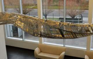
INTO THIN AIR 2
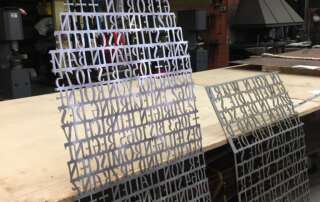
Hey Franky, thanks a million for your patience and incredible programming skills! The four plates in 2mm stainless that you lasered for me were perfect, but they were only the beginning. Nick Ervinck sliced my Photoshop rendering into sections, Thierry turned the sections into a wooden form, and Norbert and I hammered, cut and welded the steel until it fit the form; then polished it for weeks to achieve the final result.
INTO THIN AIR
Never say no to a commission that you are not up to. Say YES and then get up to it. This sculpture, made for Mattheeuws Transport in Veurne, Belgium, brought me to my knees several times before it was done. It was thrilling to push myself and the materials beyond anything even the engineers thought possible. But here it is, 150 kilos of hammered stainless floating off into thin air.
Recent Comments