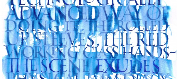
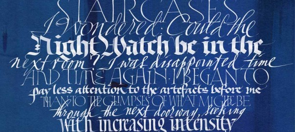
Monthly Archives: May 2016

RIJKSBOOK 3

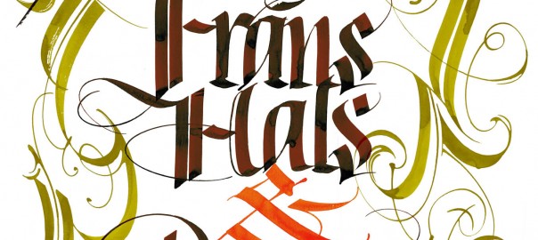
I have never been much for flourishes, as they distract from the form of the letters and belong too solidly to the past. But in this project, flourishes serve as fanfares to some of the greatest paintings in the world. Here I developed a rather unconventional style of flourish related to the strapwork decorations of 17th century architecture.

By |2022-01-26T22:22:30+01:00May 3rd, 2016|Archive|0 Comments

RIJKSBOOK 2

The Rijksbook took me back to my calligraphic roots, requiring me to do formal lettering in styles I had not practiced in years! Here is an example of Roman capitals, written with quill pen on Rives BFK paper using watercolor. The client asked for something special to accompany Vermeer’s “The Milkmaid”.

By |2022-01-26T22:22:44+01:00May 2nd, 2016|Archive|0 Comments

RIJKSBOOK 1

Since I failed to report on this project earlier, my dear readers seem to have done it for me! The Rijksbook was THE project of 2015, keeping Massimo Pollelo and me busy for at least half the year. You have already seen the videos and complained that the calligraphers are hardly mentioned at all by our illustrious client, Marcel Wanders.

By |2022-01-26T22:22:56+01:00May 1st, 2016|Archive|0 Comments
Go to Top