AND THE WORD WAS MADE STEEL
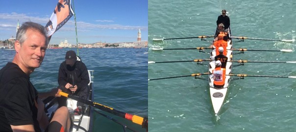
How many tributaries of the social media delta can one follow at a time? March 2017 saw me sinking into the quicksands of Instagram, meaning of course that my WordPress blog was ignored completely. Time for an update, though many of you have followed these projects on the tiny screen.