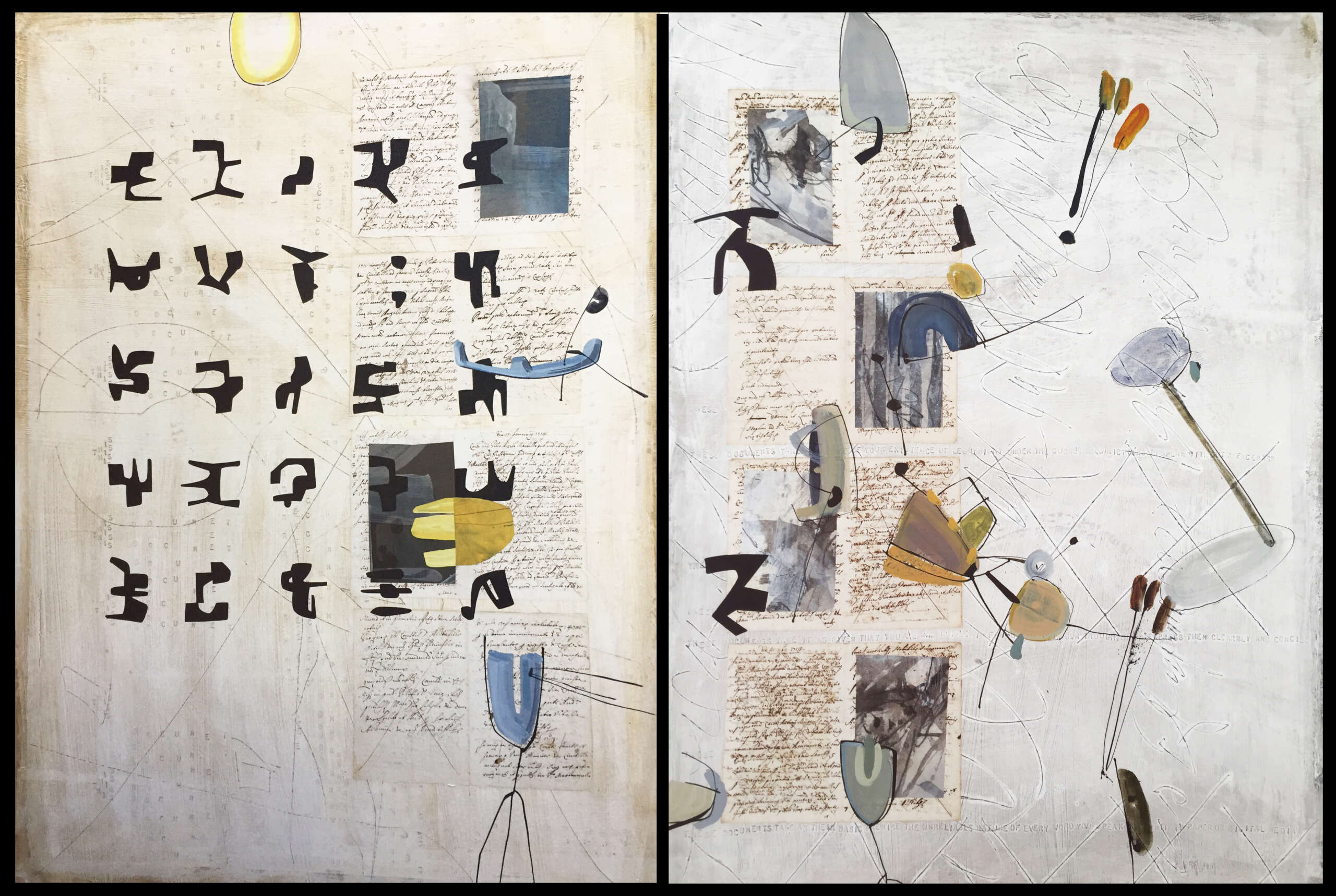
Collage diptych with old documents and an unknown script
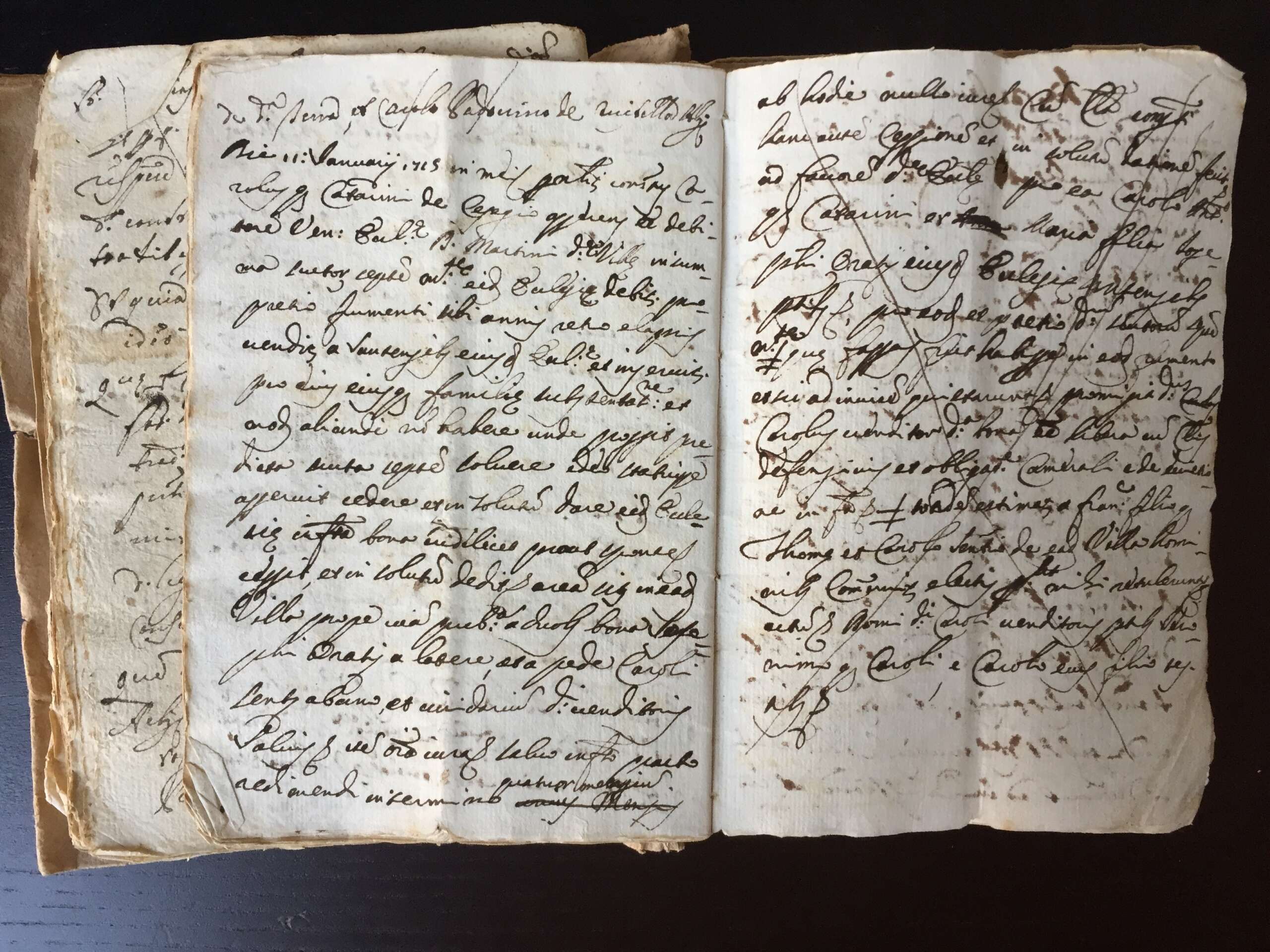
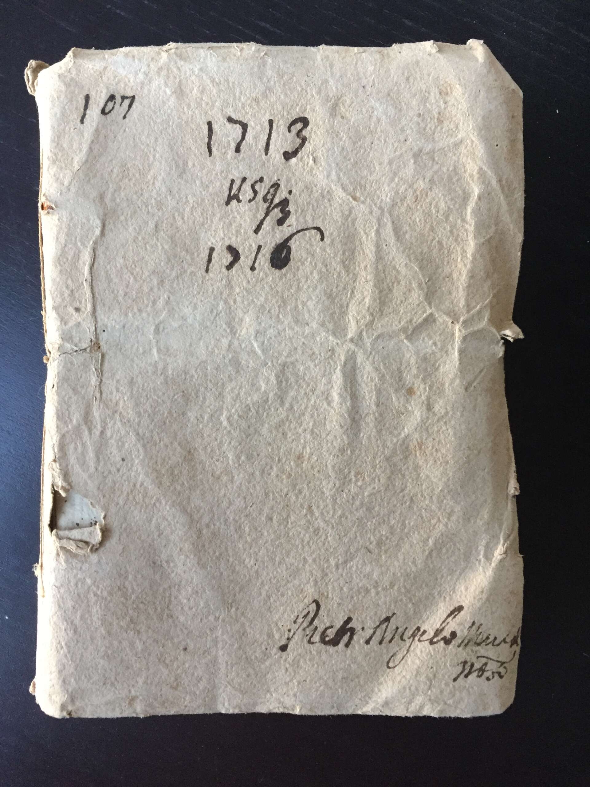
Most people go to a flea market looking for old furniture, vintage clothing, and classic LPs. Calligraphers may do the same, but when a table piled high with old documents comes into view, the fever strikes – hard. I tried to bargain, but there was no budging: 40 euro for a full volume of early 18th century legal documents in Latin. It had been a while since I made any collages using old documents, so I was happy to dig a bit deeper in my pocket and walk away with a treasure under my arm.
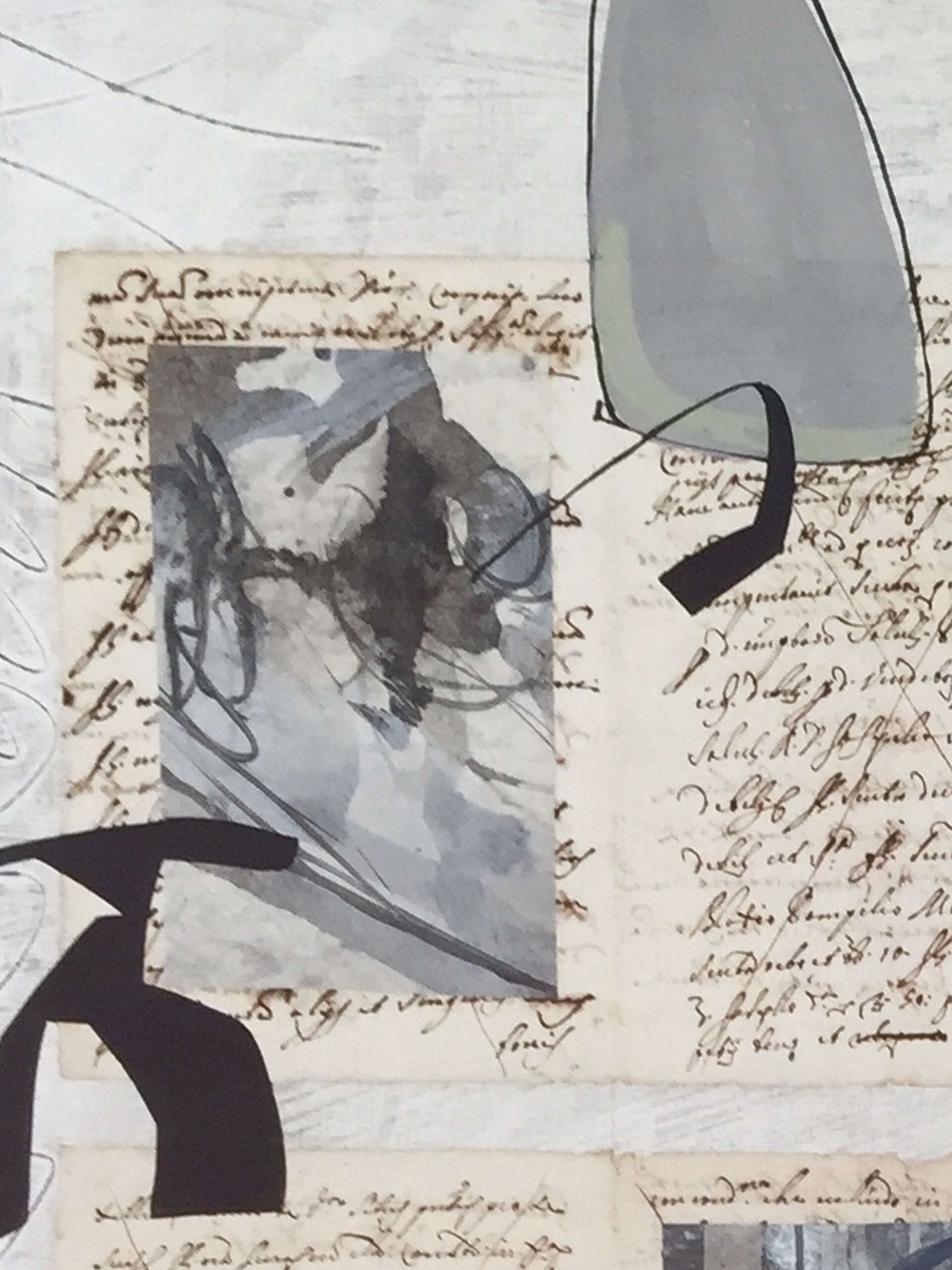
I developed my own collage technique more than twenty years ago. The first step is to stretch a sheet of Rives BFK on a plywood board. Using rice starch paste, I cover the Rives with white rice paper, cut into pieces small enough to handle easily. Onto this comes a layer of whitewash (barnyard variety), which can be textured, sanded, and scratched. At this point I use my little metal letter punches to stamp a text into the whitewash. It takes a while to spell out a sentence, picking up a letter, hammering it into the surface, putting it back and taking the next letter. I enjoy this process very much, as the slow pace of “typing” allows the sentence to develop on its own. There is no premeditation. A word or phrase pops into my head and off we go.
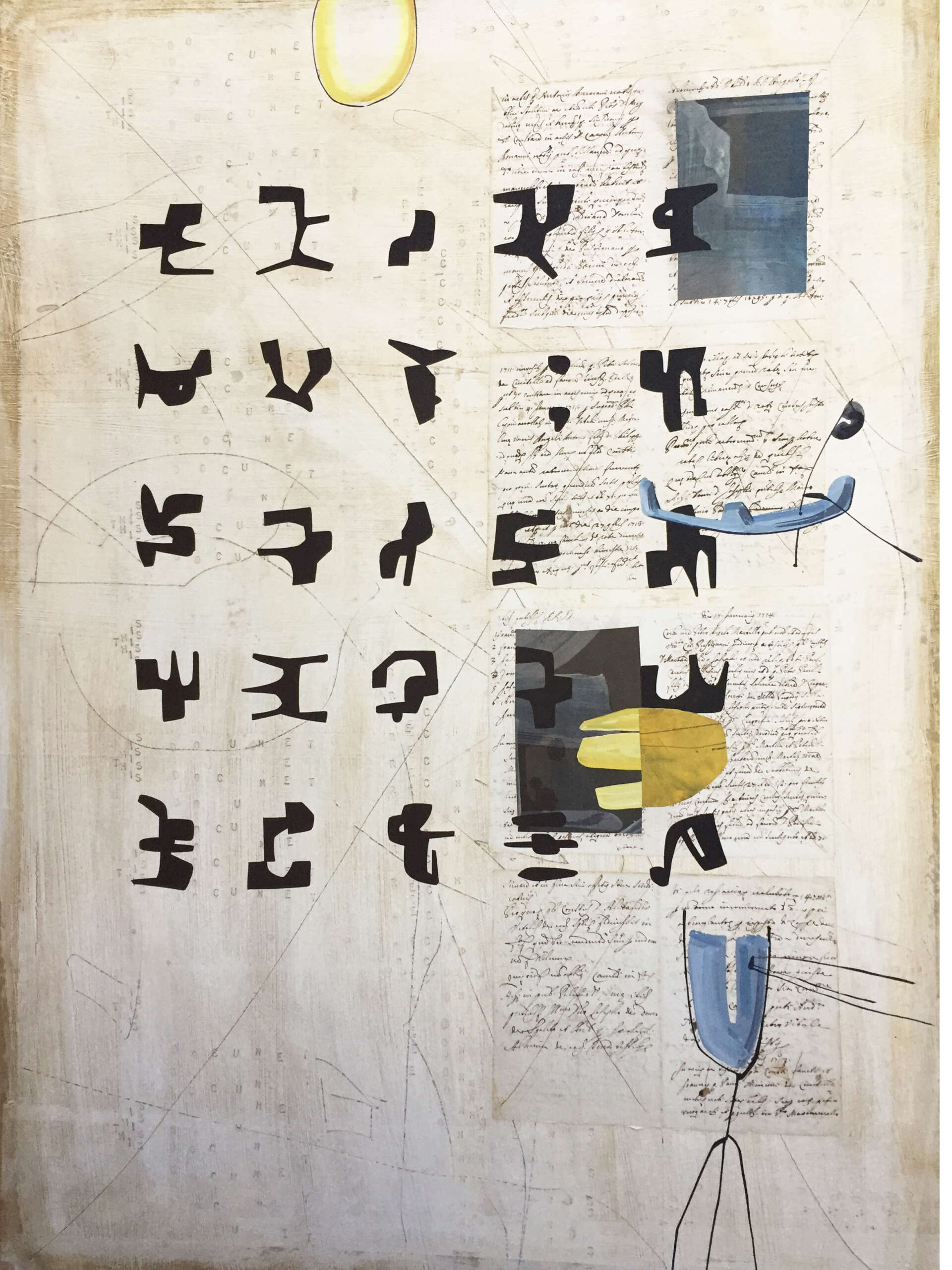
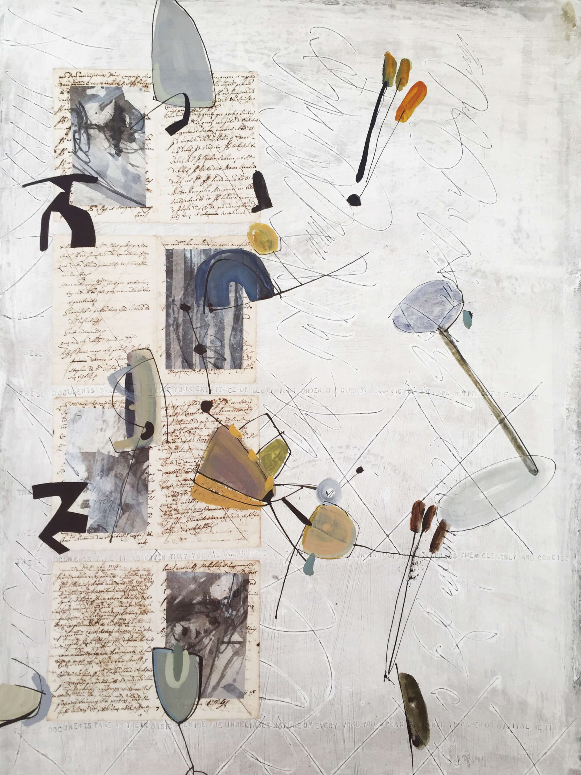
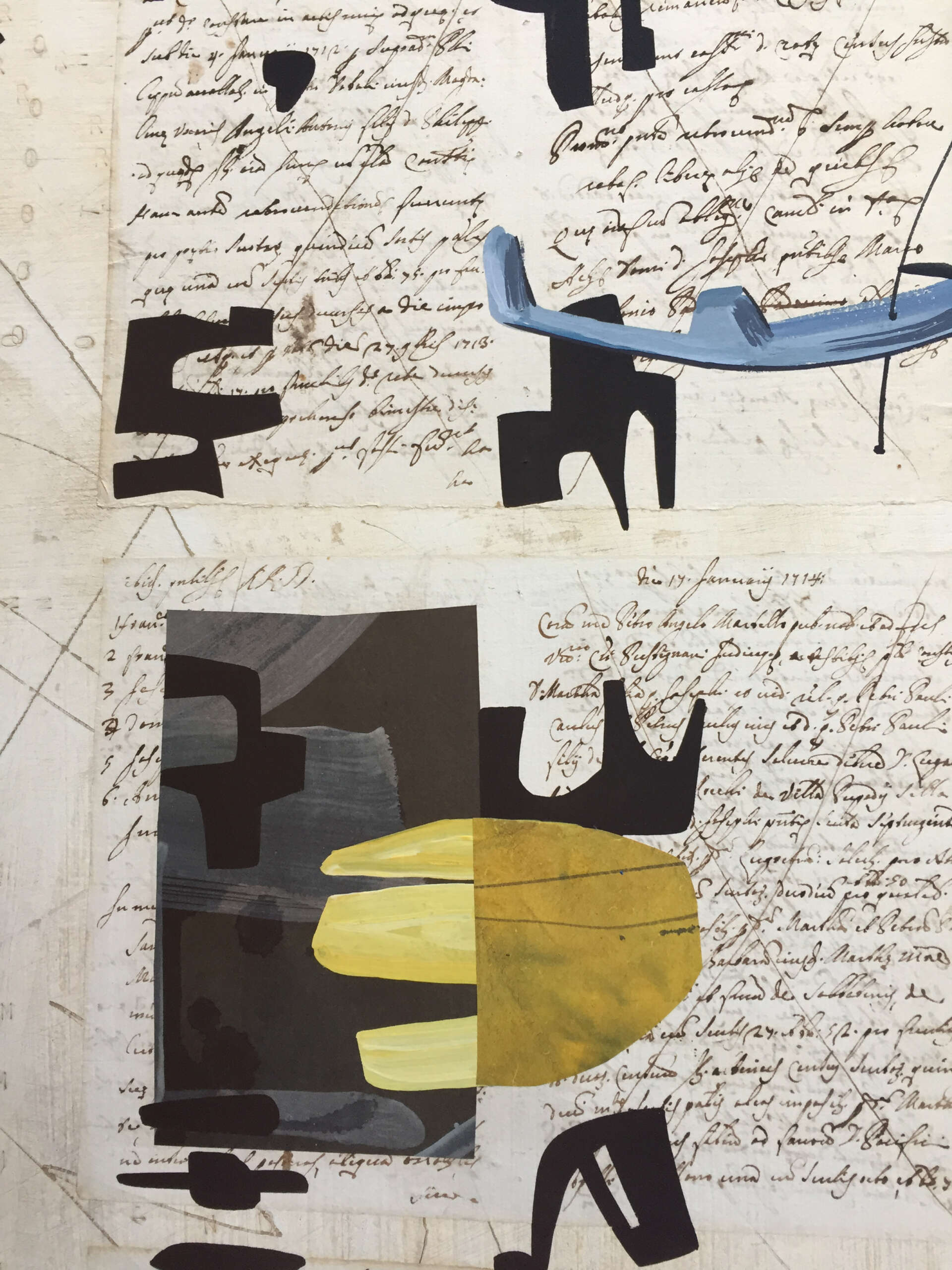
Once the stamping is done I rub gouache into the surface to bring out the letters and create a patina. Then the hard work begins. I can sit and stare at the stamped sheets for hours, wondering what to do. It was with a certain pain in my heart that I cut one gathering out of my flea market manuscript and started to arrange the sheets on the stamped background. They clearly wanted to be a diptych or a giant two page spread. The pages insisted on symmetry, so that’s what they got: vertical rows of four pages on the left and on the right. There’s no arguing with history.
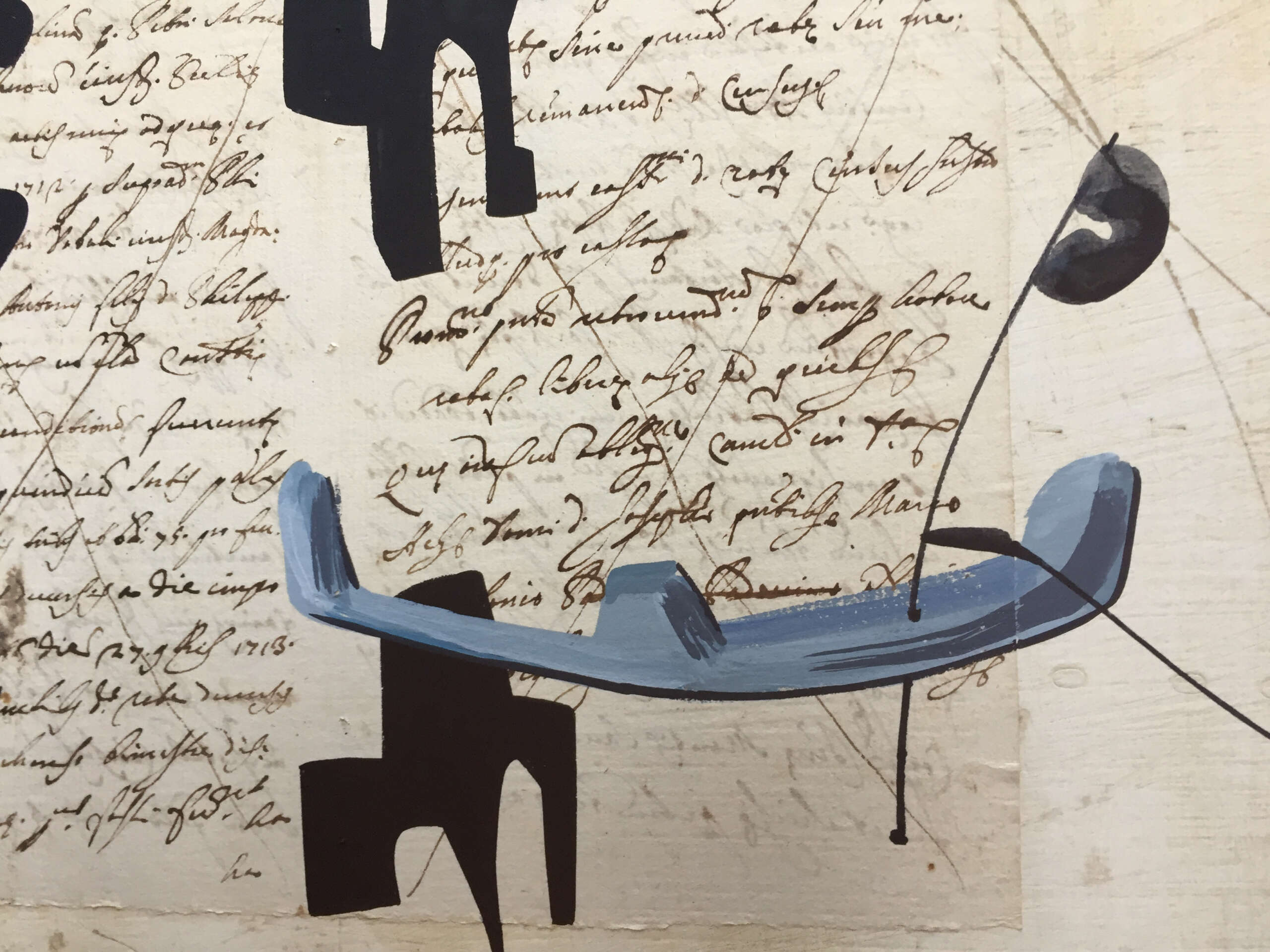
The very stable, even boring composition that resulted was a problem. Can you break a strong symmetry once it’s there? I decided to work on the right side first, allowing childish or primitive pseudo-letters to wander over the surface, paying almost no attention to what had gone before. Not bad, perhaps even good. You never know at the time.
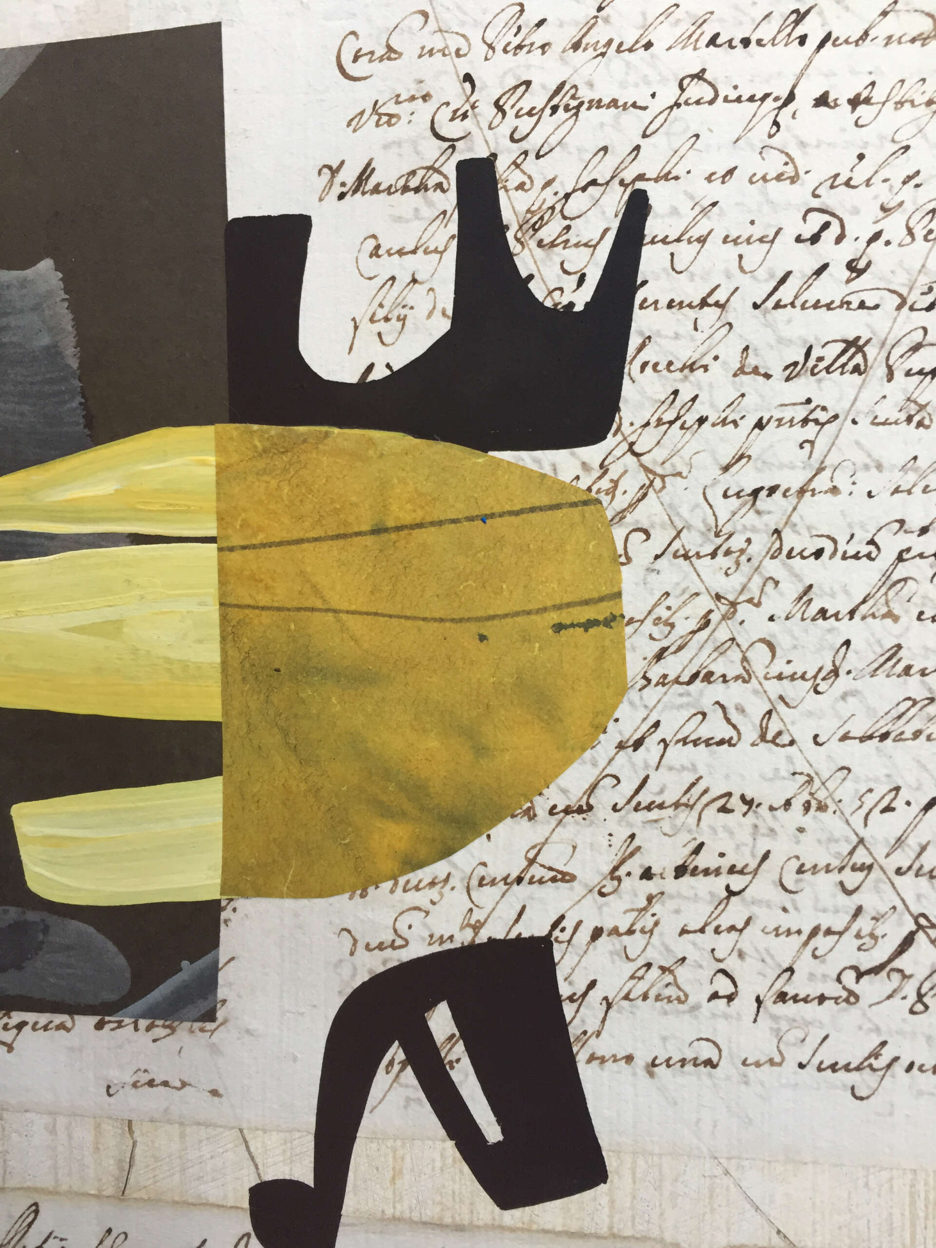
The left side needed different treatment. A few of the primitive letters migrated from the right side to the left, but I felt a need for a second grid and strong black forms. To avoid making shapes I have already used countless times, I cut squares of black paper into non-letters or near-letters and played with different arrangements on the surface. When a good arrangement was found, I simply drew the papercut shapes onto the surface and painted them with intense black gouache.
It may seem that every decision was a visual one, with no attention paid to meaning. The creation of meaning in a work of art remains the deep mystery. Perhaps the artist should avoid the temptation to interpret her/his own work. I’ll risk it this time. What makes this diptych interesting to me is the dialogue/confrontation between the elegance of a rejected history and the brute force of mute signs that could be ancient or modern. Loss and regeneration as two sides of the same diptych.

Leave a Reply