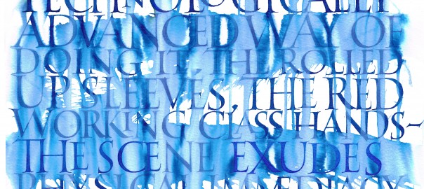
The Rijksbook took me back to my calligraphic roots, requiring me to do formal lettering in styles I had not practiced in years! Here is an example of Roman capitals, written with quill pen on Rives BFK paper using watercolor. The client asked for something special to accompany Vermeer’s “The Milkmaid”. I spent an entire day writing the text, letters approximately 5cm high, and then decided to spray the whole thing with water and let the blue ink run down the page. It was a risk, but one that worked. The designers were delighted with the result. For me it was a relief that the formal hands had not abandoned me altogether, that it is still possible to tease a nice Roman O out of my fingers.
Leave a Reply